Table of Contents
Introduction
LIMS Viewer (LIVE) is a Web-based application that allows users to retrieve sample information and analytical data from the Laboratory Information Management System (LIMS) database and display them in a graphical format. This tool is a replacement for the LIMSPeak viewer, as the technology behind the old program could no longer be supported.
User Account Privileges
All shipboard participants can use LIVE to view data on the ship during an expedition, as no data on board are flagged as moratorium. After the cruise, users can view post-moratorium data freely; a login is required to view moratorium data.
Users with LIVE editing privileges (technical personnel) can define new panels and templates. LIVE editors must have basic understanding of the LIMS database components and data structure. More information on panel and template control and maintenance can be found in later sections of this manual.
General User Instructions
LIVE can be found on the ship on the applications page, or at web.ship.iodp.tamu.edu/LIVE. On shore, it can be found at web.iodp.tamu.edu/LIVE.
LIVE is optimized for use in the FireFox browser. For best results, use FireFox on either a Mac or PC.
The LIVE main screen is divided into control bar (top) and data display (bottom) areas (Figure 1).
Definitions
Panel: A single region (plot) in the data display area. Panel types include: depth panel, recovery panel, data panels, image panels, sample panels, and lithology panels.
- Data panel: A plot that shows measured data values as symbols and/or lines and/or as text values. Multiple data sets can be shown on a single panel.
- Image panel: A panel that shows images of two types:
- Depth-referenced images such as section-half or whole-round 360° images
- Thumbnail images such as close-up photographs, microscope photo images, thin section photomicrographs, or SEM photomicrographs
- Sample panel: A panel that shows sample information (sample type, test code, request code, sample name, etc.) as area and/or text labels.
- Lithology panel: A panel that shows depth-referenced lithology descriptions (lithology prefix, principal lithology, or lithology suffix) as area and/or text labels.
Template: A collection of panels assembled into a single data query and data display. A template always includes depth columns and recovery panel and may have any number or type of other panels to the right of the recovery panel.
LIVE Control Bar
The main screen control area is divided into four sections.
Title Bar: The top blue bar (Figure 1) is the title bar and controls data view functions:
- The date/time stamp Version indicates the update version of the application
- View Data button: runs the query
- The timer next to View Data counts the time from when the button was last clicked (last database query)
- Unzoom button: restores full query view without re-querying database
- Break checkboxes: toggles section and/or whole-round break indicator lines across data plots in the data viewing area
- Login/Logout controls
- Links to the IODP applications page and this user guide

Figure 1. LIVE main screen.
Template Selector: The left-hand gray area (Figure 1,) is the template* selector (*required field):
- Available templates are shown in the drop-down list. The template name indicates what data/sample/image panels are included on the data display or may indicate a specific quality control template (Box_Corese.g. READY TO SPLIT).
- Templates are available for most common user queries. Contact technical staff if no template contains the data combinations desired.
- The selected template is applied to the database query when the View Data button is clicked. After the query is completed, selecting a different template does nothing unless View Data is clicked again.
Query Filters: The center gray area (Figure 1) contains the query filter controls (Site* and Hole* are required fields):
- A minimum of a Site and Hole must be selected from the drop-down lists. If an expedition is selected first, only Sites from that expedition are available on the drop-down list, and when a Site is selected, only valid Holes from that Site appear on the drop-down list.
- To use the additional filters in this area to narrow the data query, see Query Filters below.
- These fields are applied to the database query when the View Data button is clicked. After the query is completed, changing the filters in this area does nothing unless View Data is clicked again.
Note: The values in these fields are "sticky," meaning that they will remain as selected until changed by the user, or the browser is refreshed. This allows a user to switch templates and re-query to view a different data set using the same filter parameters.
Post-Query Filters: The right-hand gray area (Figure 1) accesses Post-Query filters.
- Changing these values changes the displayed values accordingly (see Post-Query Filters, below).
Note: These values are "sticky," meaning that they will remain as selected until changed by the user or the browser is refreshed. This allows the user to change query parameters and re-query using the same sample and/or data filters.
Basic Workflow
Figure 2 shows the initial LIVE screen before any items are selected. The minimum workflow is as follows:
- Select a template from the pull-down list.
- Select at least a Site and Hole; Expedition is an optional field.
- To see data for the entire selected Hole, click View Data.
- After a brief pause, the data will display with depth columns and recovery panel, along with image, data, sample, or lithology panels specified in that template (Figure 3).

Figure 2. LIVE main screen initial view; note that Template, Site, and Hole are required fields.
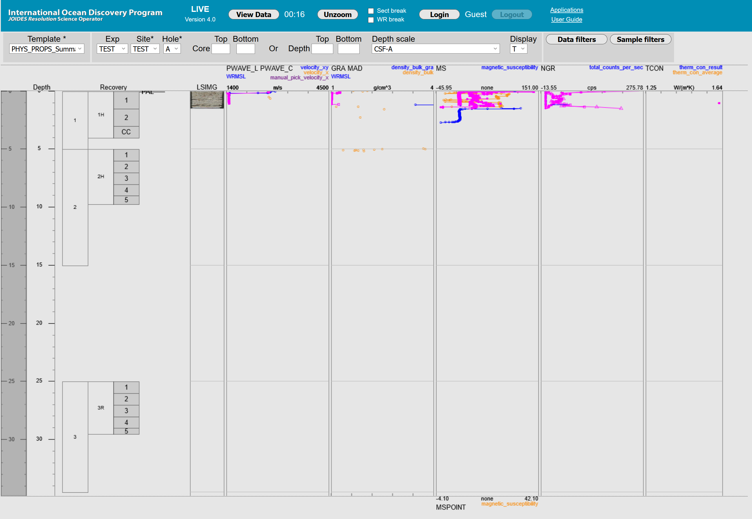
Figure 3. Example of display columns after selecting field filters.
Query Filters
Query filters are used to restrict the amount of data queried (instead of viewing the entire hole). These filters are applied before the query, meaning that in order to see them applied, the data must be queried from the LIMS by clicking View Data.
Core Filter: Enter a top core and/or bottom core to query a specific range of cores.
- Specifying only a top core retrieves data from the specified core to the bottom of the hole.
- Specifying only a bottom core retrieves data from the top of the hole to the core specified.
Depth Filter: Enter top depth and/or bottom depth to restrict the data query to a specific depth range. The depth function is inclusive, so slightly more information than the strict depth range may be returned.
- Specifying only a top depth (in meters) retrieves data from the specified top depth to the bottom of the hole.
- Specifying only a bottom depth (in meters) retrieves data from the top of the hole to the depth specified.
Depth Scale Filter: The default query is CSF-A, and CSF-B is available for any data set. If a composite depth scale is available in LIMS for the selected hole, it will appear on the drop-down list. Depth scale filters may be useful if there are overlaps in cores or sections (indicated by darker shading in the recovery panel).
- The CSF-B depth scale squeezes expanded material into the drilled interval, thus preventing overlap.
- For any core with recovery of ≤100%, CSF-B and CSF-A are the same.
- For any core with recovery >100%, CSF-B compresses the core to fit the drilled interval. This compression is linear across a core, not necessarily proportional to the actual expansion that occurred.
- A composite depth scale (CCSF) is created by the stratigraphic correlators by shifting core depths to remove overlaps. If the user selects a composite depth scale, the depth of any given core may be altered from its drilled depth. Some composite depth scale queries may return overlapping cores.
Display Filter: The display flag filter applies only to section half and section whole-round images and is primarily useful to IODP technicians as a quality control check.
- Display flag filter default is T (true).
- Display flag alternate options are "false" and "null" (blank). The latter queries image files for which the display flag is either true or false (all images).
Post-Query Filters
In addition to the filters applied before a query (core range, depth range, depth scale, and display flag), filters may be applied post-query using the Data Filters and Sample Filters buttons. Each type of filter applies only to its applicable data type; filtering by sample type in the sample filter will not affect any panels displaying analytical data.
- Post-query filters are only applied to displayed data after the Apply button within the filter selector is clicked. Filter selections can be canceled by clicking Cancel in the filter selector window.
- Post-query filters can be cleared by clicking Clear filters and Apply within the filter selector window. Note that clicking Clear filters without then clicking Apply will do nothing.
Data Filters
Data filters apply to data panels but are not applied to sample panels (Figure 4).
- Data may be filtered by sample type, shipboard test code, and/or by sample name.
- To select data filters, click the Data filters button to open the data filters window and make the desired selections for Sample type and/or Test code and/or type in a Sample name.
- Click Apply to apply the changes to the graphic panels or Cancel to abort. Applied filters will be listed below the Data filters button in the post-query filter area.
- To clear all selected data filters, click Clear filters then Apply. The list of filters under the Data filters button will disappear and graphic panels will revert to the original query parameters.
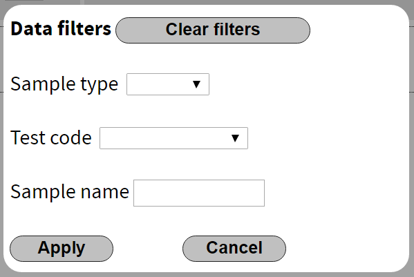
Figure 4. Data filter window.
Sample Filters
Sample filters apply only to sample panels (Figure 5).
- Sample data may be filtered by sample type, shipboard test code, sample name, request number, and/or request code.
- To select sample filters, click the Sample filters button to open the sample filters window and make the desired selections for Sample type and/or Test code and/or type in a Sample name, Request number, and/or Request code.
- Click Apply to apply the changes to the graphic panels or Cancel to abort. Applied filters will be listed below the Sample filters button in the post-query filter area.
- To clear all selected sample filters, click Clear filters and then Apply. The list of filters under the Sample filters button will disappear and graphic panels will revert to the original query parameters.
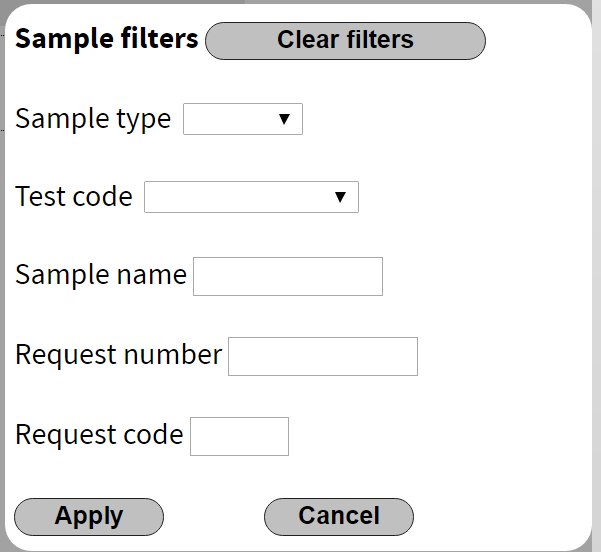
Figure 5. Sample filter window.
Sample Types:
BEAD, CAKE, CFRC, CLTR, CORE, CUBE, CUTS, CYL, GAS, HOLE, HRND, LIQ, MFRC, OTHR, PC, PWDR, QRND, SECT, SHLF, SLAB, SP, SPCM, SS, STS, TPCK, TS, TSB, UCHN, WDGE, WRND
Test Codes:
BIO, CARB, CELL, CHNS, CLU, CNTMASSVOL, CONT_MASS, CUBENG, DIAT, DINO, DML, FORAM, FORAMB, FORAMP, H2, HS, ICP, IW, LOI MAD, MBIO, MSPH, NANNO, NOTESTS, OSTRA, PAL, PALY, PFT, PMAG, PP, RADS, RMS, SCRAPE, SED, SEM, SRA, STRX, TCH4, TOC, TS, TSB, TSS, VAC, VP, XRD, XRF
Results Display
Navigation and Control
Once data are retrieved, a number of methods of navigation for viewing data exist. In each case, navigation does not run another query but instead uses the data already retrieved. In this way, a user may zoom in to a region of interest and then zoom back out (to a maximum of the full scale of the originally-retrieved data; Unzoom) without having to wait for a database query to run.
Depth Navigation Bar
The left-most panel in the data area shows the depth columns, divided into two areas as shown in Figure 6. Upper Image: the darker-shaded area in the first column is the depth navigation bar, which always shows the top and bottom depths of the full query data range. The lighter-shaded right-hand depth column displays the depth range currently displayed. The depth navigation bar can be scrolled to zoom in or out, dragged up or down the full depth rage of the query, or expanded and contracted using the triangular "handle" areas. Scrolling using the mouse wheel on a data panel will also zoom the depth selected with the depth navigation bar. Lower Image: the depth control is "zoomed in" to view from 4 m to about 35 m depth.
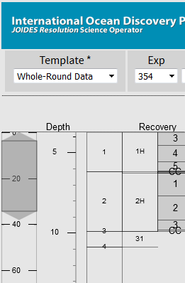
Figure 6. Depth columns and depth navigation bar (shaded area in first column).
Recovery Panel
The recovery panel is shown in Figure 7. The panel is divided into four column areas:
- Interval cored: shows the full interval cored (or drilled) and the core or drilled interval number
- Interval recovered: length recovered for that core, along with core type
- Section: number and length of sections taken from that core
- Whole-round samples taken from specific sections
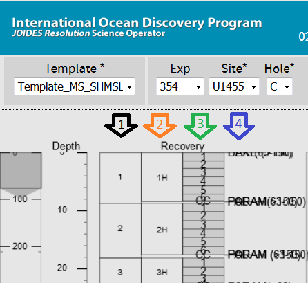
Figure 7. Recovery panel with four columns.
To zoom in on data from a specific cored interval, core, section, or whole round, click on the specific boxed area on the display panel.
Figure 8 shows the recovery panel at different scales selected from the recovery panel.
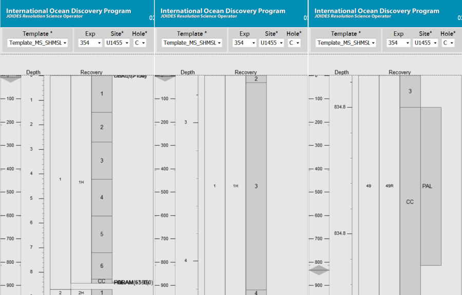
Figure 8. Recovery panel zoomed in to various scales. Left: core view, middle: section view, right: whole-round sample taken from a core catcher. Note the size and position of the depth navigation bar and the depth column for each view.
Mouse Zoom and Position Control
The mouse wheel can be used to zoom the data display in and out; all panels scale at the same rate. The mouse can also be used to "grab" and move the display up and down the hole within the bounds of the original query. Note that because of screen refreshes with mouse movement, using the mouse controls may result in program lag.
Unzoom
Clicking Unzoom on the Title Bar returns the display to the full scale of the original data query. It will not zoom out to the entire hole unless that is what was queried. This feature allows the user to zoom in within queried data and zoom back out to full results without having to run a new database query; this speeds up operations significantly.
Section and Whole-Round Sample Breaks
The checkboxes Sect break and WR break on the title bar display horizontal lines across all data panels where section breaks occur or where whole-round samples (e.g., interstitial water or microbiology samples) were taken, respectively. Either or both checkboxes may be selected.
Panel View Options
Data panels have scale bars on either the top or bottom or both horizontal axes. Components plotted against the top axis are shown in the header of the panel; those plotted against the bottom axis are shown in the panel footer.
The panel options window for each axis provides the capability to alter data and sample properties (Figure 9). Changes are shown in the panel immediately; Exit closes the window.
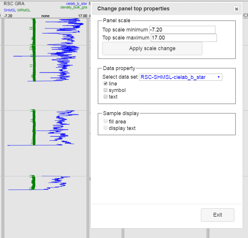
Figure 9. Panel options for top axis.
Panel Scale
The panel axis scale limits can be set to autoscale to the range of data retrieved (+5% to keep the data points from the edge) or set to a specific numerical range (e.g., 0–100 for L*, which by definition cannot be <0 or >100). The default axis scaling can be overridden by clicking in the header (for top axis) or footer (for bottom axis) to open the panel options window. It is recommended to position this window away from the data panel being adjusted so that changes can be seen before clicking Exit.
Any numerical value can be entered into the minimum and/or maximum fields, then click Apply scale change. The change in scale will be immediately visible on the selected panel.
Data Property
For data panels, the user may choose to display or hide connecting lines, symbols, and/or text. If multiple data sets are displayed on the same axis, as shown in Figure 9, the user may switch between the color-coded data sets (in this case, blue for b* data and green for GRA density) in the drop-down selector to change the line, symbol, and/or text options independently for each type of data. Note that only track data will display lines. Discrete sample data displays only as symbols or text.
*Figure 9. Panel options for top axis.*Changes are shown instantly in the data panel. To cancel a change, simply uncheck the property selected.
Sample Display
If the panel to be changed is a sample panel, the Sample display options will enable, allowing the user to toggle area shading (fill area) or display text (display text button).
Advanced User Options
Users with appropriate privileges may log in to access the Panel Builder and Template Builder.
Panels can display data sets that may be analytical data, sample information, images, and/or lithology. Data types can be combined in a single panel if desired.
Templates are made up of several panels that plot side by side on the main results screen after the LIMS query. Related data sets can be viewed simultaneously for comparison or trend recognition, or several types of data can be viewed together as an overview for quality control.
Note: The Panel Builder and Template Builder windows appear in new tabs in the browser. If the user logs out of LIVE on the main screen, or closes its tab, the Panel Builder and Template Builder windows will be orphaned. They will appear to be functional, but will not allow the user to take any action.
Note: If the user plans to make a lot of panel and template changes, a good technique is to open LIVE in two different browsers (e.g., Firefox and Chrome), make and save changes on one, and observe the changes on the other. This prevents the user from having to log in repeatedly after refreshing the browser in order to access new templates, if any.
Panel Builder
Click Panel Builder on the main screen to open a new tab for the Panel Builder. The entry screen shows version information, login account, and a list of panels with two controls: New and Select panel (Figure 10).
 Figure 10. Panel selector.
After selecting an existing panel to edit or modify, change the panel name to ensure that panels already used in active templates remain as originally designed. Changing or deleting a panel in use in active templates may cause problems for other users. Proceed with care; DO NOT give a panel the same name as an existing panel. Panel naming convention is optional but may reduce panel duplication: include at least component plotted + analysis code (if needed) + axis + instrument (if needed) + other information (if needed). Examples:
MS_WRMSL_top_MSPOINT_SHMSL_bottom RSC_AB_top_L_bottom SRANL_HI_top_OI_bottom PWB_yz_manual_top
Creating a New Panel
Click New on the Panel Builder main screen to display the controls for building a panel. Figure 11 shows the Panel Builder options available. Each number in blue corresponds to an entry in the following table.
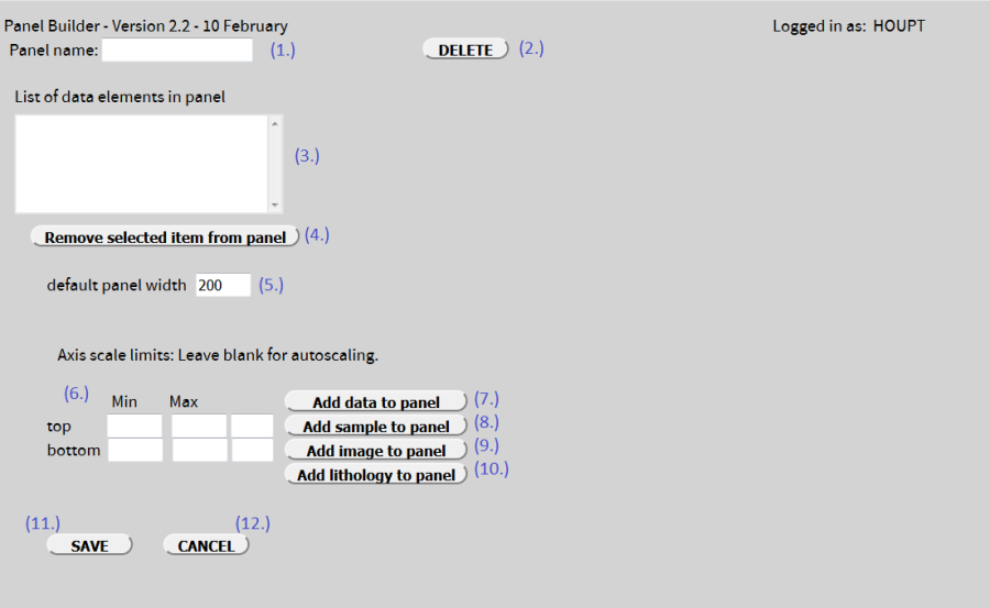
Figure 11. Building a new panel.
Panel Builder fields and controls.
No. | Field/Control Name | Field/Control Description |
1 | Panel name | Text field for the panel name; the name should conform to panel naming convention (see above). Use a new/unique and meaningful name for each panel created. |
2 | Delete (panel) | Deletes the selected panel if already saved. NOTE: DO NOT delete a panel that may be used in an active template. |
3 | Data element display | Shows the data elements defined for that panel, including top or bottom axis, type of data, default display type, etc. See Figure 15, below. |
4 | Remove selected item from panel | Removes a highlighted data element in from the panel. Note: Do this only if the panel has been renamed from original. |
5 | Default panel width | Sets the default width for this panel (minimum = 100; 200 is suggested) results are displayed after a query. |
6 | Min/Max for Top/Bottom | Sets predefined limits for top and bottom axis scales. If the data parameter has a unit, the third field will be populated. Leaving the Min and Max fields blank will cause the data display to autoscale the minimum and/or maximum values based on the data set retrieved. |
7 | Add data to panel | Click this button to open a window to add analytical (typically numerical) data to the panel (data panel). |
8 | Add sample to panel | Click this button to open a window to add sample data to the panel (sample panel). |
9 | Add image to panel | Click this button to open a window to add either depth-referenced (section and section half) images or thumbnail images (e.g., close-ups, photomicrographs, or SEM) (image panel). |
10 | Add lithology to panel | Click this button to open a window to select a DESClogik template, tab, and lithology parameter. Only certain descriptive parameters are allowed (lithology panel). |
Note: Combined data type panels may be created (e.g., an image panel showing a section-half photo can have analytical data added to the same panel to plot over the image). Note: Plot multiple data sets on a single axis only if they share the same unit (e.g., PWL, PWC, and/or PWB can be plotted on the same axis; MSL, MSP, and MS can be plotted on a single axis). | ||
11 | Save | Click SAVE to save the panel using the name given in the name field and return to the base Panel Builder screen; the user will be prompted if required information is missing. Note: rename an existing panel before saving. |
12 | Cancel | Click this button to discard all changes and return to the base Panel Builder screen. |
Adding Data to a Panel
Controls for adding data to a panel (#7 on Figure 11) are shown in Figure 12. This panel will show L* data as line/symbol on the plot (track data can show lines and symbols; discrete data will show only symbols). This data set is assigned to the Physical Properties data group. The plotting axis has not been selected (top or bottom). The panel definition default view showing data values as lines/symbols can be changed to area and/or text using the Panel View Options on the results screen.

Figure 12. Add data to panel.
Field/Control Name | Field/Control Description | Required? |
Axis | Select top or bottom axis for the horizontal scale of this panel | Yes |
Analysis | Select the analysis code for the desired data; this populates Instrument (WRMSL or STMSL only) and Component list | Yes |
Instrument | Display instrument choices are for WRMSL or STMSL loggers; not active for any non-whole-round logger analysis | No |
Component | Select the desired component to be plotted; only one component can be selected for a panel at a time | Yes |
As Text Radio Button | Set the default behavior for the panel to display/not display data values as text labels (this can be changed later in Panel View Options) | No |
As Area Radio Button | Set the default behavior for the panel to display/not display data as filled area plots (not suitable for most data types) (this can be changed later in Panel View Options) | No |
As Line/Symbol Radio Button | Set the default behavior for the panel to display/not display data as lines and/or symbols (this can be changed later in Panel View Options) | No |
Data Group | Assign a data group for this particular set of data; used in panel filtering controls in the template builder | Yes |
Add | Add the defined parameters to the list of data elements in the panel | NA |
Cancel | Abort the operation without saving the parameters | NA |
Analysis Codes:
ALKALINITY, CHNS, COUL, DH_TEMP, DO, FORM_FACT, GC3, GRA, H2, LOI, MAD, MSPOINT, NEEDLE_PEN, NGAFID, NGATCD, NGR, ORIENT, PENET_CONE, PENETRATE, PWAVE_B, PWAVE_C, PWAVE_L, PYC, RGB, RSC, SALINITY, SPINNER, SRANL, SRM, TCON TITRA_MAN, TOC TOR_SHEAR, VANE_SHEAR
Data Groups:
C_chemistry, D_description, I_depth_referenced, I_thumbnail, M_magnetism, P_physical_properties, S_sample
Adding Samples to a Panel
Figure 13 shows the controls for adding samples to a panel (#8 on Figure 10). The panel shown here will display the all sample types collected in the depth range of the query as text. The text will display at the top left-hand corner of the depth from which the sample was collected (default convention), and the "Samples" label will appear on the top axis of the panel. The display as text or area can be changed on the results display using the Panel View Options.
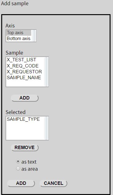
Figure 13. Add sample to panel.
Field/Control Name | Field/Control Description | Required? |
Axis | Select top or bottom axis for the horizontal scale of this panel | Yes |
Analysis | Select the analysis code for the desired data; this populates Instrument (WRMSL or STMSL only) and Component list | Yes |
Instrument | Display instrument choices are for WRMSL or STMSL loggers; not active for any non-whole-round logger analysis | No |
Component | Select the desired component to be plotted; only one component can be selected for a panel at a time | Yes |
As Text Radio Button | Set the default behavior for the panel to display/not display data values as text labels (this can be changed later in Panel View Options) | No |
As Area Radio Button | Set the default behavior for the panel to display/not display data as filled area plots (not suitable for most data types) (this can be changed later in Panel View Options) | No |
As Line/Symbol Radio Button | Set the default behavior for the panel to display/not display data as lines and/or symbols (this can be changed later in Panel View Options) | No |
Data Group | Assign a data group for this particular set of data; used in panel filtering controls in the template builder | Yes |
Add | Add the defined parameters to the list of data elements in the panel | NA |
Cancel | Abort the operation without saving the parameters | NA |
Samples:
SAMPLE_TYPE, X_TEST_LIST, X_REQ_CODE, X_REQUESTOR, SAMPLE_NAME
Adding Images to a Panel
Figure 14 shows the image panel controls. The top control panel will show the full cropped section-half line-scan image aligned to both top and bottom depths of the interval where the image was taken. The bottom control panel will show the jpeg file of the close-up thumbnail image aligned at the top of the depth interval where it was collected.
*Note that only one choice can be made for these two fields, either depth-referenced or thumbnail. A panel cannot have both types.
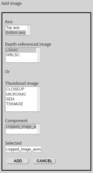
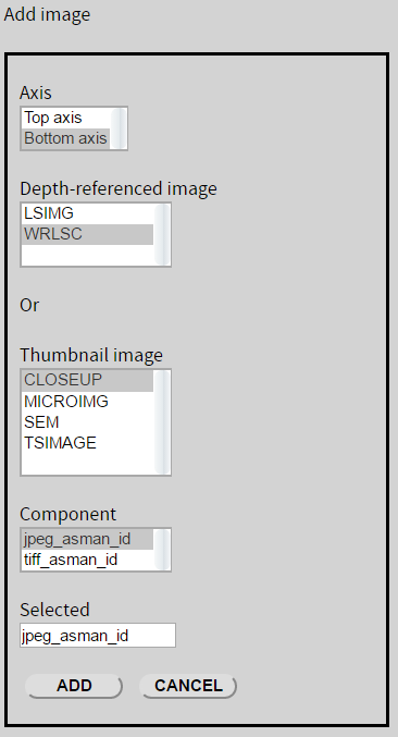
Figure 14. Add image to panel.
Field/Control Name | Field/Control Description | Required? |
Axis | Select top or bottom axis for the horizontal scale label of this panel | Yes |
Depth-referenced image OR | Select the depth-referenced (section or section half) image to be displayed | Yes (*) |
Thumbnail image | Select the thumbnail image (closeup, micro image, SEM image, or thin section image) to be displayed | Yes (*) |
Component | Populated by selecting the image type, shows the plottable component(s) for that image type | Yes |
Selected | Displays the selected component to be added to the panel | NA |
Add | Adds the defined parameters to the list of data elements in the panel | NA |
Cancel | Aborts the operation without saving the parameters | NA |
Adding Lithology to a Panel
Figure 15 shows the add lithology to panel controls. This panel retrieves specific lithology components. This panel must be built for each expedition. The panel shown will plot the principal lithology component as a colored area block. In the following example tThe lithology is picked up from the Sediment tab in the 362_-macro DescLogik DESCLogik template. The label "Principal lithology" will appear on the bottom axis of the panel.
Important! This panel will only work for a specific expedition DESClogik template, and DESClogik tab. It must be changed before it will function for a different DESClogik template or tab.

Figure 15. Add lithology to panel.
Field/Control Name | Field/Control Description | Required? |
Axis | Select top or bottom axis for the horizontal scale label of this panel | Yes |
Template name | Select the expedition-specific DESCLogik template to be used for this panel; lithology is usually found in the macroscopic template for sediment cores. Clicking a template will populate the Tab name field (takes a few seconds) | Yes |
Tab name | Select the tab name where the lithology parameters can be found; selecting a tab that does not contain any of the allowed lithology components will produce an error message warning the user | Yes |
Component | Populated by selecting a tab with the allowed components; select the lithology component to be plotted | Yes |
As Text Radio Button | Sets the default behavior for the panel to display/not display text labels | No |
As Area Radio Button | Sets the default behavior for the panel to display/not display as filled area plots | No |
Add | Adds the defined parameters to the list of data elements in the panel | NA |
Cancel | Aborts the operation without saving the parameters | NA |
Lithology Components:
lithology_before_principal; principal_lithology; lithology_after_principal; lithology_ab, lithology_abc, lithology_bc (a = lithology before principal, b = principal lithology, and c = lithology after principal)
Editing an Existing Panel
Warning! Changing or deleting a panel in use in active templates may cause problems for other users! Proceed with care.
Highlight a panel from the panel list on the Panel Builder main page and click Select Panel. The builder screen will populate with defined parameters for the selected panel (Figure 16). The name can be changed, data elements added or removed, default panel width changed, and min/max top and bottom axis scales set or (if left blank) set to autoscale.
Important: Rename the panel to avoid conflict with this existing panel being used in active templates.
This panel shows caliper P-wave velocities in the x, y, and z directions, both manual pick and autopicked, all on a single plot. Autopicked and manual pick x-direction measurements are shown on the top axis, and autopicked and manual pick y- and z-direction measurements are shown on the bottom axis. The data values will be shown as symbols, as they are discrete measurements, and top and bottom axis scales will automatically set to fit the data values in the sets plotted on each axis. As these components all share the same unit, they will be directly comparable plotted on the same axes.
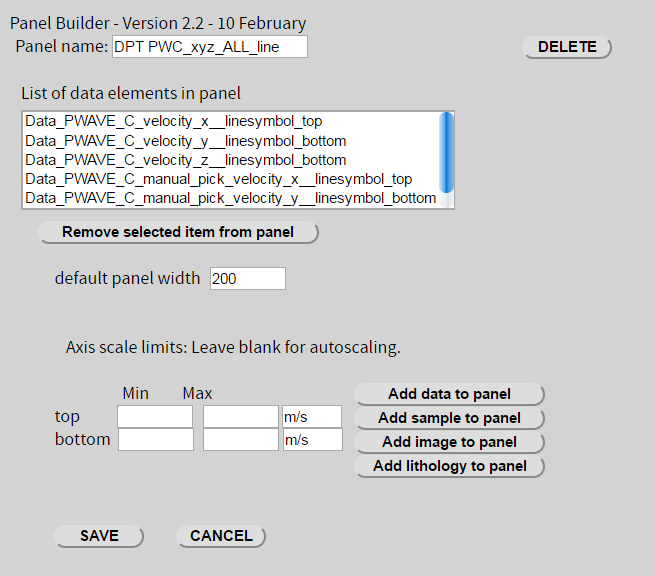 Figure 16. Data elements in panel.
Template Builder
To see newly created panels in the Template Builder, refresh the browser tab. New panels will not appear without doing so. Login will be maintained in this case—note that refreshing the main screen will cause automatic logout to occur.
Click Template Builder on the main screen to open a new tab for the Template Builder. The user will see version information, what account they are logged in as, and a list of templates with two controls: "New" and "Select template" (Figure 17).
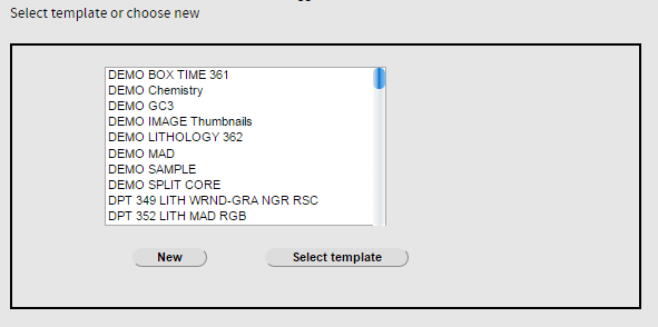
Figure 17. Template builder - list of templates.
Creating a New Template
Click New on the Template Builder main screen to display the controls for building a template. Figure 18 shows the options available to build a template. Each number in blue corresponds to an entry in the corresponding table below.
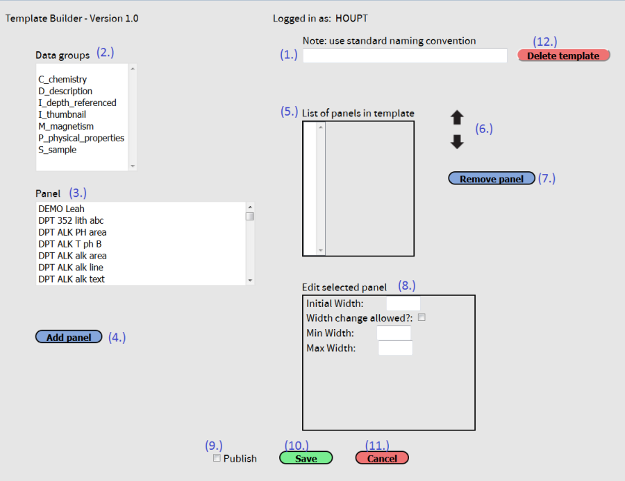 Figure 18. Template builder "New" screen.
Template Builder fields and controls
No. | Field/Control Name | Field/Control Description |
1 | Template name | Text field for the template name; the name should conform to the template naming conventions (see below). |
2 | Data groups | User may filter the panel list by selecting a data group. Some panels have multiple data groups assigned, and these panels will show up in all applicable data groups. |
3 | Panel | Displays the panels available to add to the template; filterable by using data groups (2). User highlights a panel before moving to the next control. |
4 | Add panel | Adds the highlighted panel to the list of panels in the template (appends to end). |
5 | List of panels in template | List of the current panels in the template, in order of their display (left to right). |
6 | Reorder panels controls (up/down arrows) | These controls are used to move a highlighted panel up or down in the order in the list of panels in template. |
7 | Remove panel | Removes a highlighted panel from the list of panels in template. |
8 | Edit selected panel | Allows definition of initial panel width, minimum and maximum panel width, and whether panel width can be changed in the active template in LIVE. |
9 | Publish checkbox | Selecting this checkbox will make the template viewable to users without a login. Only authorized, logged-in users can see templates without this selection. |
10 | Save | Click this button to save the template and return to the base Template Builder screen; the user will be prompted if required information is missing. Note: Give the template a unique name before saving. |
11 | Cancel | Click to discard all changes and return to the base Template Builder screen |
12 | Delete template | Click to delete the template completely. Use with caution! |
Template naming conventions
Include enough information so users can tell what is in the template, for example:
LSIMG_COUL_RGB_RSC-L MS_MSP GRA_MAD PWL_PWB_PWC (or maybe PWAVE_ALL) 349_LITH_WRND-GRA_NGR_RSC
Alternatively, templates used for routine QA/QC can be named for their function, for example:
BOX TIME LITHOLOGY 362 READY TO SPLIT WHOLE-ROUND DATA MICRO IMAGES ALL
Editing an Existing Template
An existing template can be modified and saved as a new template. Warning: rename the modified template before saving! The existing template below (Figure 19) was built as a quality control check on whole-round data. The panels in the template are listed (note the panel names are not exactly like they were named in the Panel Builder, as the application adds additional information to the panel name. The five panels in this template include (1) magnetic susceptibility from WRMSL and STMSL, both plotted on the same axis (top), (2) GRA density from WRMSL and STMSL, both plotted on the same axis (top), PWL (by default, x- and y-directions only, (4) NGR plotted on the top axis, and (5) thermal conductivity plotted on the top axis. Note that both the panel names and the template names are clear enough to determine what they contain.
If we wanted to add the section-half image to this template, we would select Data group I_depth_referenced, select the panel that shows the cropped jpeg or tiff, and click Add panel. If we wanted the image to be the first panel shown, we would use the up arrow to move the image panel to the top of the list. Very important – we would rename the template something descriptive such as Whole-Round Data plus LSIMG.
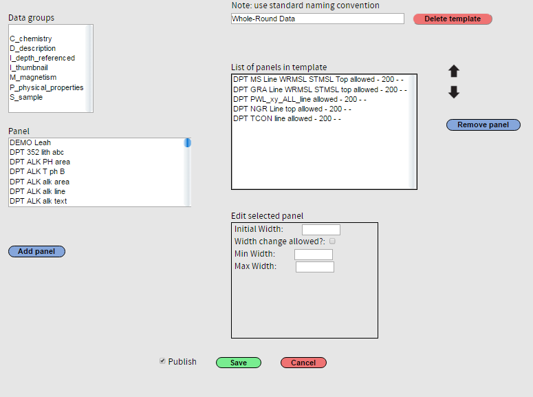 Figure 19. Edit an existing template.
Data Viewer
Figure 20 shows a data query with section-half image (LSIMG) in the first 3 data panels: (1) with COUL-calcium carbonate overlain (orange open circles; note that the color of the data point or line matches the color of the corresponding header); (2) with RGB (labels on the bottom axis); (3) with L*.Panel 4 shows RSC L*a*b*, and panel 5 RGB data again, this time scaled to separate the red and green (top axis) from the blue (bottom axis). Panel 6 shows COUL calcium carbonate (bottom axis), same values as in the first panel, this time with data results value (text) next to each point. On all data panels, the magenta areas are duplicate samples or duplicate runs.

Figure 20. Control panel with data view.
Core overlap (darker shading) between 18H-CC and 19H-1 is shown on Figure 21. Note that the lithology panel shows overlapping lithology as well.
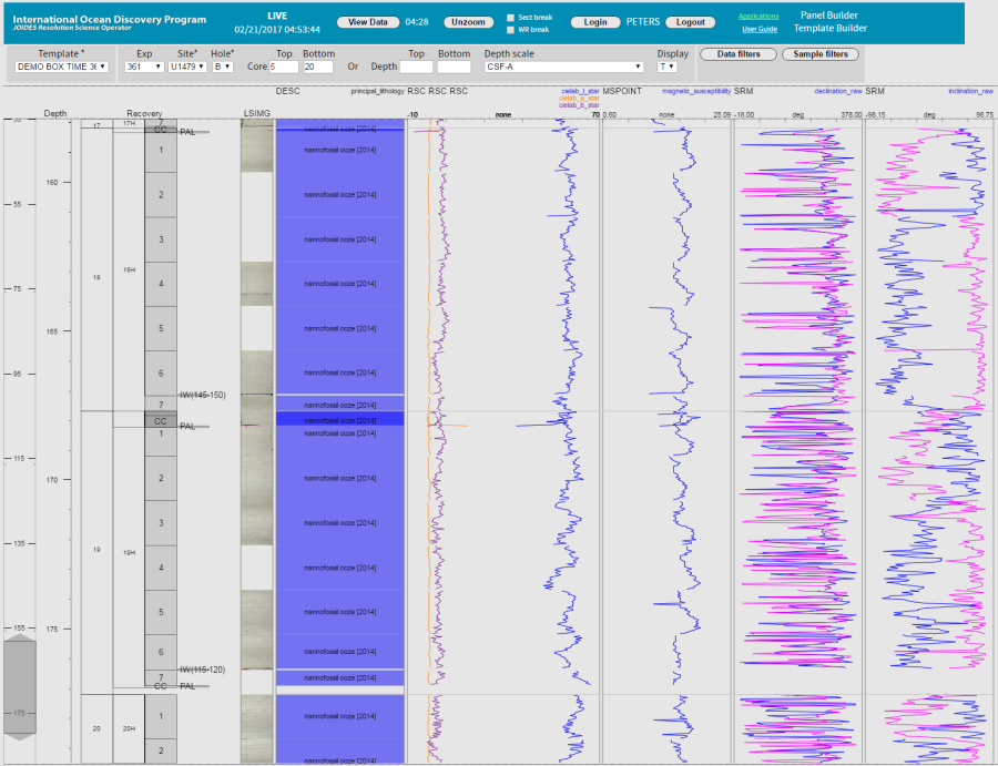 Figure 21. Core overlap between 18H-CC and 19H-1 on the CSF-A depth scale.
Changing the search query to depth scale CSF-B resolves the overlap (Figure 22).
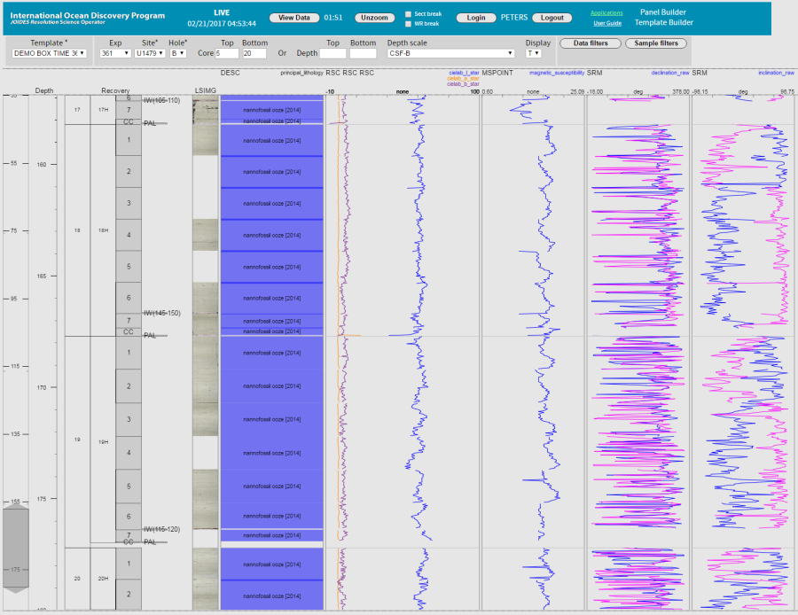 Figure 22. No core overlap on the CSF-B depth scale.
This data query displays LSIMG, sample type as area intervals and text, and sample panels with request code and test list as text (Figure 23).
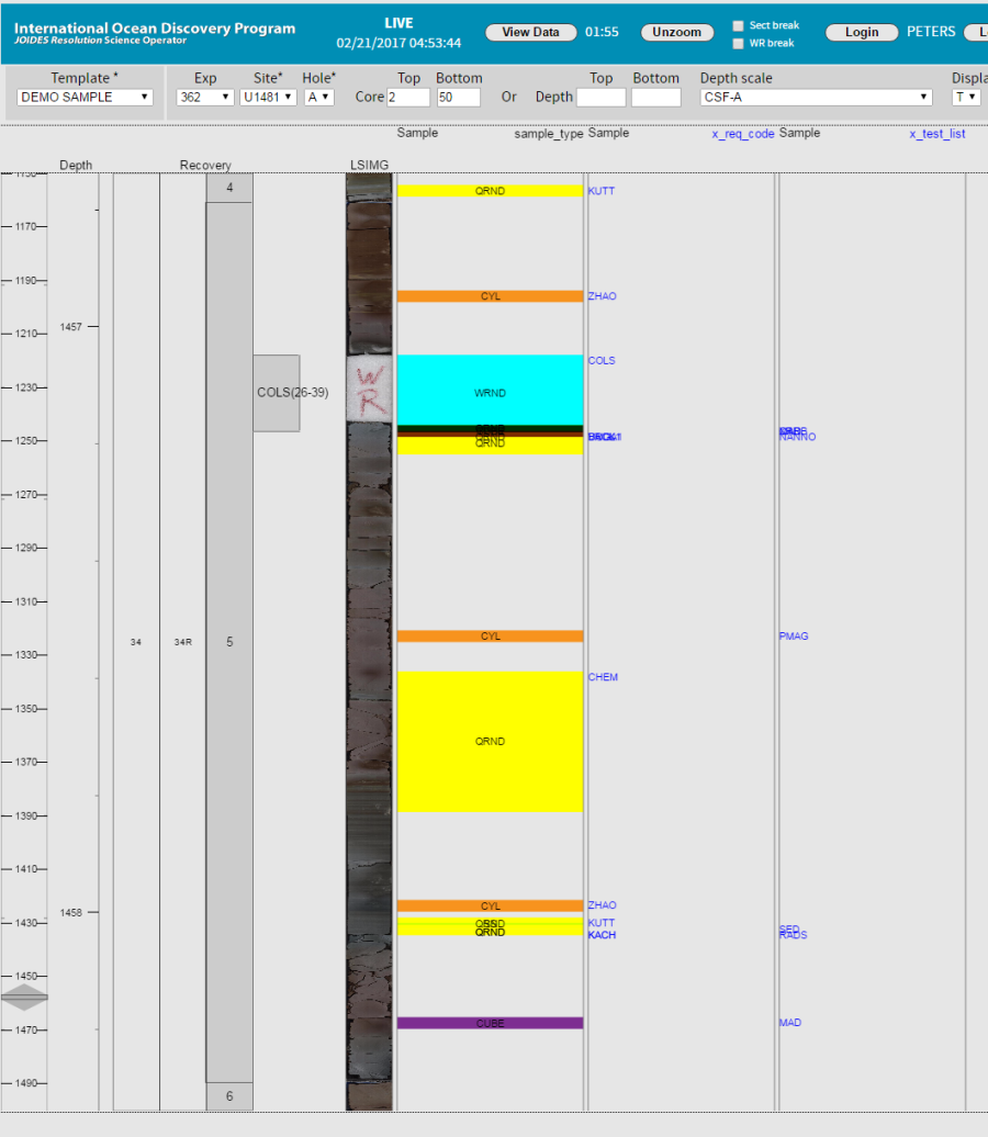
Figure 23. Sample type, request code, and test list.
Archived
- JRSO-LIMS Viewer (LIVE) UG v371.pdf

1 Comment
Unknown User (25dbb4e563432e130164eb687464000b)
Aug 04, 2018Reviewed August 5th, 2018.